The Front Page
I started producing my front page on photoshop. First of all though I made a flat plan of how I wanted my front page to look and where I wanted everything to be positioned on the page. This was useful for reference purposes when I was designing my actual front page.
First Attempt :
The image on the left shows the first stages on my magazine being made. I have roughly stuck to my flat plan initial idea for example the masthead is at the top and the captions are spread around the sides of the page.
Second Attempt :
The image on the right shows how I have progressed in the production of my magazine. The fact that I have now added a main image and a barcode onto the front page makes it look more professional and more like existing magazines on the market already. However as the image creates a black background on the front page, I had to change the font colour of one of the captions. ('exclusive interview with miami' changes from purple to pink in order to show up against the black). I also had to make other alterations such as removing the pictures of lipstick because otherwise their white backgrounds would have clashed against the black background created by the image.
Third Attempt :
The final alteration that I made before I had completely finished my front page was changing the font style of the captions. I decided to change the font from 'cheri liney' which was more squiggly and fun to 'arial black' which is more generic and plain. I decided to make this change because otherwise it may have been hard to understand and even though I changed the font to a more sombre and less fun font, I think that my target audience will still be attracted to it due to the fact that my front page already features two other 'funky and fun' fonts.
The Contents Page
I made a lot of alterations to my contents page and didn't follow my contents page flat plan at first as I wanted to experiment with which style worked best.
Second Attempt :
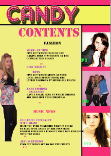
On my second attempt I completely changed the way my contents page was set out. I organised it into colomns and changed the sizes of the lettering. I got the idea of having all the photos on one corner from a magazine that caters for a similar target audience to mine.
 Also on my second attempt I decided to follow my flat plan ideas. I purpously chose to make my contents page look very much like my front page because I wanted to keep up consistency.
 Third Attempt :
On my third attempt I developed my contents page further. I changed the font of 'contents' to cheri liney in order to keep consistency with the rest of the publication. I also decided to make the text in line with each other so that it replicated coloumns. I chose to put stars around the background in order to make it not look so empty and not just a plain yellow background but instead feel more girly and lively. There is also a part at the bottom where I have chosen to put a facebook and twitter logo in order to make my publication seem more dynamic, accessible to readers and to incorporate what existing magazines feature.


No comments:
Post a Comment